View Poll Results : Is this the new SWS logo for you??
Yes - Get it produced!!
30
83.33%
No - Try something else!!
6
16.67%
Is this the new SWS logo, cast your vote!!
19 February 2009, 08:50 PM
Scooby Senior
Thread Starter
Join Date: Aug 2006
Location: At home counting pennies!!!
Posts: 2,571
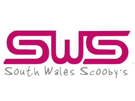
Is this the new SWS logo, cast your vote!!
Is this good enough to take pride and place on your car as the new SWS logo, cast your vote
[IMG]
[/IMG]
If it gets the thumbs up they will hopefully come in a range of colours
19 February 2009, 08:53 PM
Scooby Senior
Thread Starter
Join Date: Aug 2006
Location: At home counting pennies!!!
Posts: 2,571
I have set a closing date 2 weeks after the first post, so get your vote in while you can
19 February 2009, 08:53 PM
Scooby Regular
Join Date: Jun 2005
Location: TAXI ANYONE!!
Posts: 1,528
Likes: 0
Received 0 Likes
on
0 Posts
ME ME ME pink with silver for me
19 February 2009, 08:55 PM
Scooby Regular
Join Date: Feb 2004
Location: Chilling me boots
Posts: 11,140
Likes: 0
Its simple, does what it says on the tin and its pink
Great work
19 February 2009, 09:10 PM
Scooby Regular
Join Date: Aug 2005
Location: Bebind the wheel of my red rice rocket
Posts: 5,585
Likes: 0
Received 0 Likes
on
0 Posts
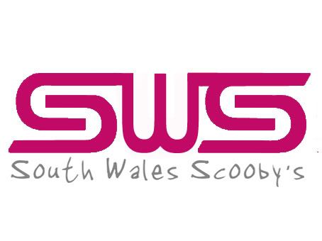
Very nice mate, is it possible to do the w in similar curves to the S's?
19 February 2009, 09:41 PM
Scooby Regular
Join Date: Apr 2007
Location: knocking on the door of 400bhp with v power smashed through it with e85
Posts: 1,201
Likes: 0
Received 0 Likes
on
0 Posts
yes looks very good
19 February 2009, 09:48 PM
Scooby Regular
Join Date: Apr 2007
Location: Back in the Jap fold
Posts: 2,797
Likes: 0
Received 0 Likes
on
0 Posts
Quote:
Originally Posted by
pippyrips
Very nice mate, is it possible to do the w in similar curves to the S's?
I agree
If not it does it for me anyway
19 February 2009, 09:55 PM
Scooby Regular
Join Date: Feb 2008
Posts: 273
Likes: 0
Received 0 Likes
on
0 Posts
agree the W looks a lil too square against the S's...... love it anyway tho and definately in....!
19 February 2009, 10:11 PM
Scooby Senior
Join Date: Apr 2006
Location: south wales rhondda
Posts: 4,067
Likes: 0
Received 0 Likes
on
0 Posts
the w stands out for wales tho
can someone get one photo shopped up with curves and then put both together ??? then we can see what looks best
19 February 2009, 10:13 PM
Moderator
Join Date: Sep 2002
Location: South Wales
Posts: 13,846
Likes: 0
Looking good guys
19 February 2009, 10:14 PM
Scooby Regular
Join Date: Apr 2006
Posts: 2,420
Likes: 0
Received 0 Likes
on
0 Posts
I did a search and found this link
SWS
Social Welsh and Sexy
Last edited by WRX RCY; 19 February 2009 at 10:15 PM .
19 February 2009, 10:16 PM
Scooby Regular
Join Date: Apr 2006
Posts: 2,420
Likes: 0
Received 0 Likes
on
0 Posts
19 February 2009, 10:34 PM
Scooby Regular
Join Date: Apr 2008
Location: bringin up the next generation
Posts: 193
Likes: 0
Received 0 Likes
on
0 Posts
i like it with the square "w" think if it was curvy like the s, then it may be too bland, but lookin good
19 February 2009, 10:36 PM
Scooby Senior
Thread Starter
Join Date: Aug 2006
Location: At home counting pennies!!!
Posts: 2,571
I know what your saying about the W. What Lee said..............................Ellis???
19 February 2009, 10:58 PM
Scooby Regular
Join Date: May 2006
Posts: 1,609
Likes: 0
Received 0 Likes
on
0 Posts
19 February 2009, 11:01 PM
Scooby Senior
Thread Starter
Join Date: Aug 2006
Location: At home counting pennies!!!
Posts: 2,571
Bloody hell, that was quick!!
Think i prefer the square W though, the rounded ones look like a pair of nuts
Last edited by evil.soup; 19 February 2009 at 11:02 PM .
Reason: edit
19 February 2009, 11:07 PM
Scooby Regular
Join Date: Oct 2008
Location: Planet Earth
Posts: 13,684
Likes: 0
Received 0 Likes
on
0 Posts
Quote:
Originally Posted by
evil.soup
Bloody hell, that was quick!!
Think i prefer the square W though, the rounded ones look like a pair of nuts
Or put full stops just below the W and they might just look like a pair of funbags
, personally I still prefer the previous design
19 February 2009, 11:14 PM
Scooby Regular
Join Date: May 2006
Posts: 1,609
Likes: 0
Received 0 Likes
on
0 Posts
19 February 2009, 11:15 PM
Scooby Senior
Join Date: Apr 2006
Location: south wales rhondda
Posts: 4,067
Likes: 0
Received 0 Likes
on
0 Posts
Quote:
Originally Posted by
Cannon Fodder
Or put full stops just below the W and they might just look like a pair of funbags
, personally I still prefer the previous design
thought that was funny
19 February 2009, 11:16 PM
Scooby Senior
Join Date: Apr 2006
Location: south wales rhondda
Posts: 4,067
Likes: 0
Received 0 Likes
on
0 Posts
Quote:
Originally Posted by
RED2
19 February 2009, 11:19 PM
Scooby Regular
Join Date: Apr 2008
Location: bringin up the next generation
Posts: 193
Likes: 0
Received 0 Likes
on
0 Posts
Quote:
Originally Posted by
RED2
pmsl red ur a rude boy
19 February 2009, 11:21 PM
Scooby Regular
Join Date: Oct 2008
Location: Planet Earth
Posts: 13,684
Likes: 0
Received 0 Likes
on
0 Posts
Quote:
Originally Posted by
RED2
Bloody hell that was quick, cracking job though on the design I can just about use a colouring in book so respect to you for a cracking design
19 February 2009, 11:37 PM
Scooby Regular
Join Date: May 2006
Posts: 1,609
Likes: 0
Received 0 Likes
on
0 Posts
or a younger pair of "funbags"
19 February 2009, 11:52 PM
Scooby Senior
Join Date: Sep 2003
Location: South Wales
Posts: 3,821
Likes: 0
Received 0 Likes
on
0 Posts
the top one works for me pink too cant go wrong
20 February 2009, 12:23 AM
Scooby Regular
Join Date: Oct 2005
Location: Spec C Ltd 385/407
Posts: 1,147
Likes: 0
my proposal.......................
Last edited by apac; 20 February 2009 at 12:29 AM .
20 February 2009, 12:27 AM
Scooby Regular
Join Date: Oct 2005
Location: Spec C Ltd 385/407
Posts: 1,147
Likes: 0
Quote:
Originally Posted by
evil.soup
Is this good enough to take pride and place on your car as the new SWS logo, cast your vote
[IMG]
[/IMG]
If it gets the thumbs up they will hopefully come in a range of colours
uncreative and unoriginal
20 February 2009, 01:06 AM
Scooby Regular
Join Date: Apr 2006
Location: SOUTH WALES SPANNERS CLUB
Posts: 1,676
Likes: 0
Received 0 Likes
on
0 Posts
what about trying the south wales scoobys writing in the same font as the sws logo.
20 February 2009, 09:40 AM
Scooby Senior
Join Date: Apr 2006
Location: south wales rhondda
Posts: 4,067
Likes: 0
Received 0 Likes
on
0 Posts
Quote:
Originally Posted by
apac
my proposal.......................
not being funny mate but it's a car club and subaru based
thats why it's designed to be like the sti
your design seems like its almost taking the p$ss in imo stating we are associated with sheep
and looks like a band poster , i don't think people want to have a sticker on their car with a sheep on it
Last edited by The Stitcher; 20 February 2009 at 10:56 AM .
20 February 2009, 10:43 AM
18 June 1815 - Waterloo
Join Date: Dec 2004
Location: To the valley men!
Posts: 19,156
Quote:
Originally Posted by
apac
Evil.Soup: There should be time for more entries before you try and rush your entry through. seems very unfare to push your design so hard before giving others a chance to show their ideas and creative spirit.
This was discussed at the SWS meeting on Wednesday and in previous posts. Most who agree are active SWS supporters and they have the first shout. It's evil.soups project and he was set the task.
You can become an SWS supporter by paying your subs. Have a look in the thread on the main Wales page
I like the design, it's got a bit of the STi logo going on and with the denise of the SWRT it seems fitting that a change is due.
20 February 2009, 10:58 AM
Scooby Regular
Join Date: Apr 2006
Location: SOUTH WALES SPANNERS CLUB
Posts: 1,676
Likes: 0
Received 0 Likes
on
0 Posts
how is evil soup pushing his entry through, when he's not the one who designed the logo.


 [/IMG]


 19 February 2009, 10:11 PM
 can someone get one photo shopped up with curves and then put both together ??? then we can see what looks best


 thats why it's designed to be like the sti
  and looks like a band poster , i don't think people want to have a sticker on their car with a sheep on it


